
Multi-layer Charts
You can superimpose multiple Pointmap, Linemap, and Geo Heatmap charts on one another to look for correlations between datasets.
To create a multi-layer chart:
- Create a Pointmap or Geo Heatmap chart.
- Click the Add Layer tab.
- Create a Pointmap or Geo Heatmap chart in the new layer.
- Click the Master tab.
- Adjust the Opacity of the chart layers using the sliders on the right.
You can change the order of the layers by dragging the contents of a layer field on top of another layer field.
The limit is eight layers in a single chart, up to your server’s memory and processing capacity.
Multi-layer Chart Example
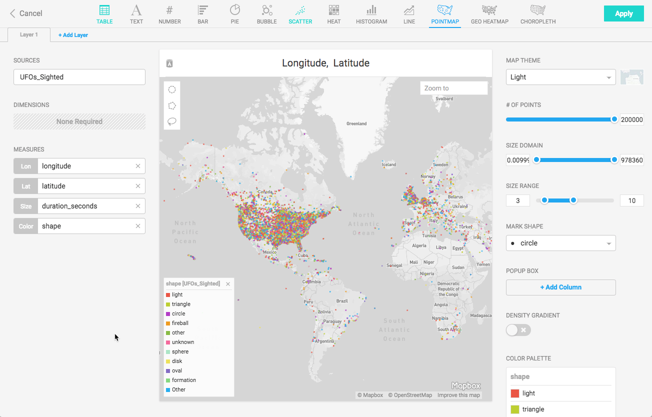
Create a new Pointmap. For the Data Source, use the official database of UFO sightings.
Set the Lon measure to longitude and Lat measure to latitude. Set the Size measure to duration_seconds. Set the Color measure to shape.
Click the Add Layer tab, and create a Geo Heatmap. Set the data source to the Flights database. Set Lon to origin_lon and Lat to origin_lat. Set the Color measure to depdelay.
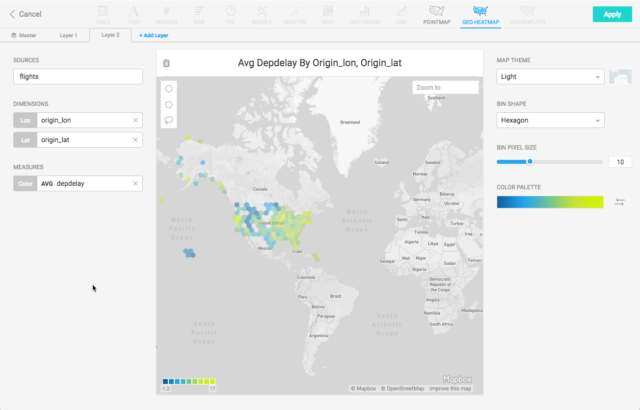
The resulting chart compares a Geo Heatmap of flight departure delays to a Pointmap of UFO sightings.
Click the Master tab, and reduce the opacity of the UFOs Sighted chart to enhance the visibility of the Flight delay information.
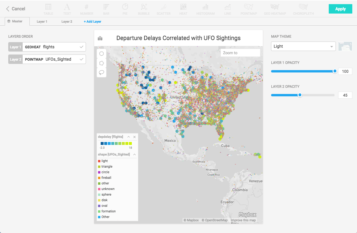
Clearly, some flights have been delayed where UFOs have been sighted, making it impossible to make a definitive statement that there is no correlation between the two datasets. Spooky.