Pie Chart
The Pie chart lets you compare the relative sizes of groups of data as segments of a circle.
| Features | Quantity | Notes |
|---|---|---|
| Required Dimensions | 1+ | Minimum 1, no limit, null dimensions optional. |
| Required Measures | 1-2 | Measure 1 = segment size, Measure 2 = segment color. |
Use a Pie chart to show the relative proportions of a small number categories. If you have many categories, or the values are very similar in size, a Bar chart is often a more effective way to compare the categories. Note also that you should not create Pie charts with a mix of positive and negative values.
Chart Style
You can style your chart as a Donut or a Pie, depending on your dessert preference. The default Donut style tends to make it easier to see the relative sizes of the chart divisions.
Sort By
SORT BY determines the order of the sections starting at the 12 o'clock position and proceeding around the chart in clockwise fashion.
# of Groups
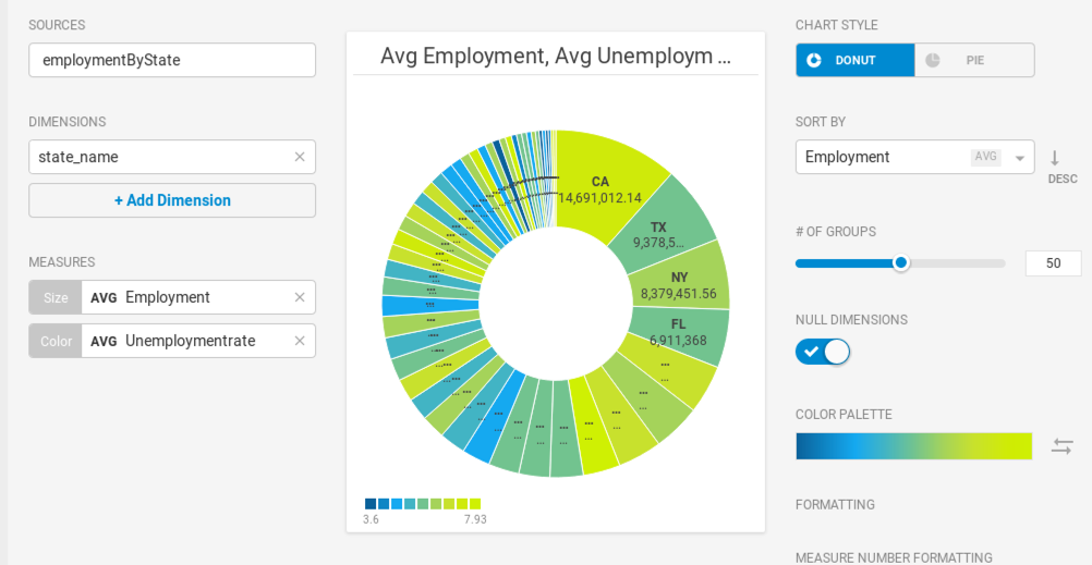
You can divide your chart into up to 100 values. A smaller number of values often results in a more readable chart.
Null Dimensions
You have the option of hiding null dimensions if they are not significant in your data sample.
Color Palette
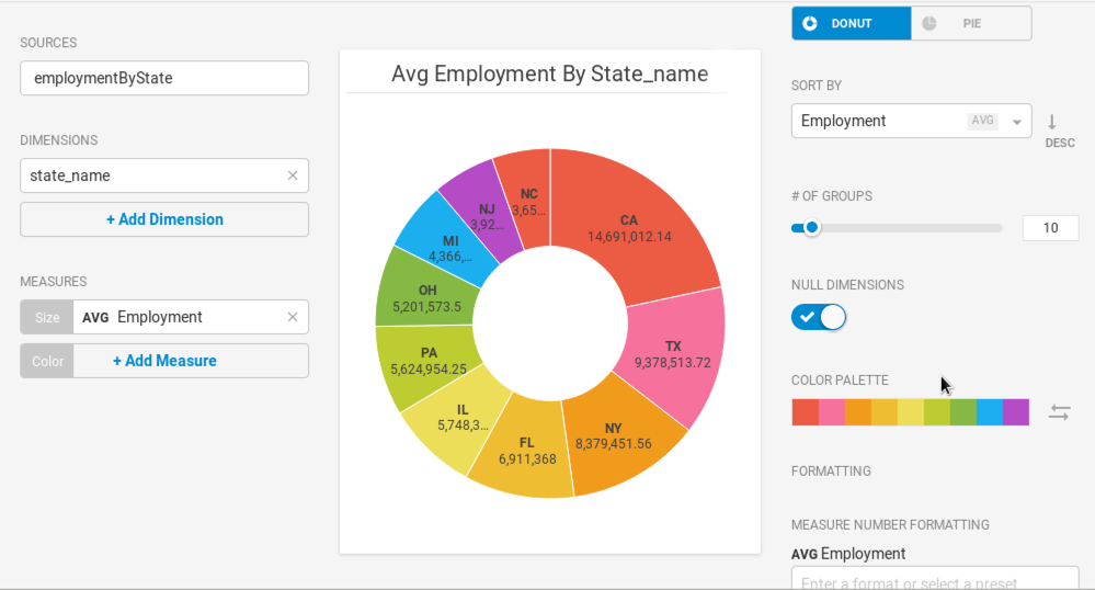
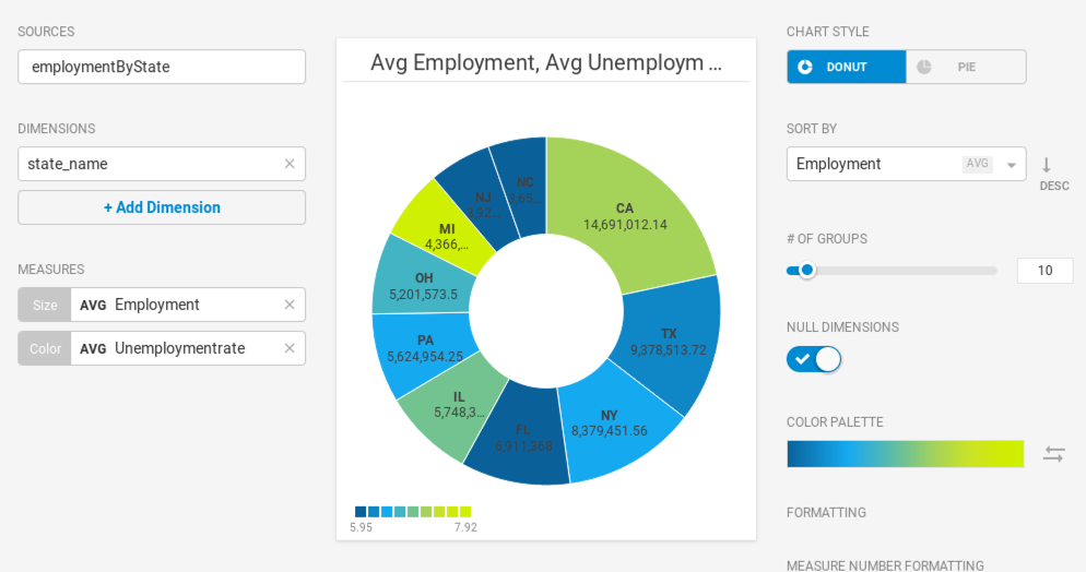
You can choose 1, 2, 3, 4, or 9 colors for your chart. You can also use a gradient color to show relative values within a dimension.
Custom Measure Formatting
You can also use custom measure formats for the value in your chart. See Customizing Measure and Date Formats.
Pie Chart Examples
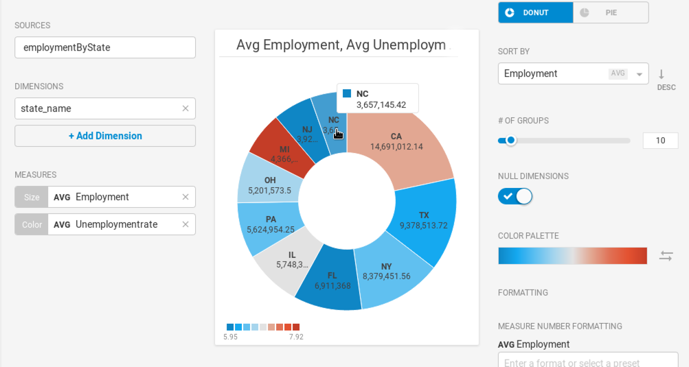
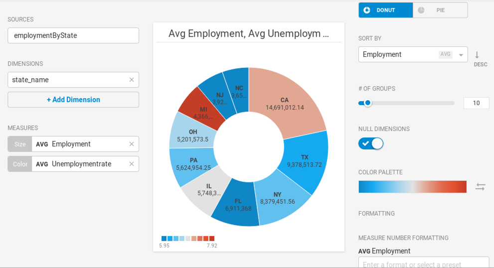
Create a new Pie chart. Choose a Data Source. This example graphs employment statistics for all 50 United States for the year 1980. The data is available at the University of Kentucky website.
Use the Dimension state_name and the Size measure AVG Employment.
You can use the Color measure to reflect the Unemployment_rate, providing more nuanced understanding of the relative segments.
There are 50 states, so it might be tempting to show all 50 in the chart. The problem becomes obvious when there are too many segments with too little variation to provide meaningful analysis. 10 or fewer is probably a reasonable setting for # of Groups.
Changing the Color Palette might make an outlier such as Michigan stand out more effectively.
Where the segments do not have sufficient width to display the measures, you can mouse over to see a pop-up with the information for your chosen segment.