Line Chart
The Line chart represents a series of data as a line or multiple lines, plotted across time or another numerical dimension.
| Features | Quantity | Notes |
|---|---|---|
| Required Dimensions | 1-2 | Dimension 1 = X Axis, Dimension 2 = Series |
| Required Measures | 1 | Measure 1 = Y Axis. |
The optional multi-series capability of the Line chart can break out values by an additional dimension.
Line Chart Examples
Create a new Line chart. Choose a Data Source. This example uses the official database of UFO sightings
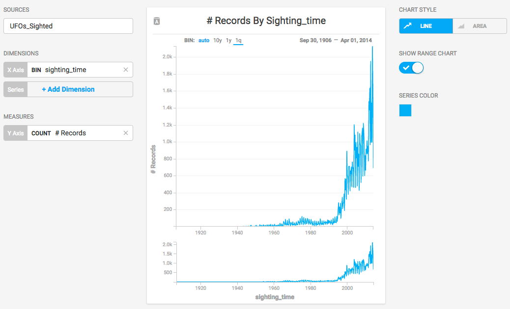
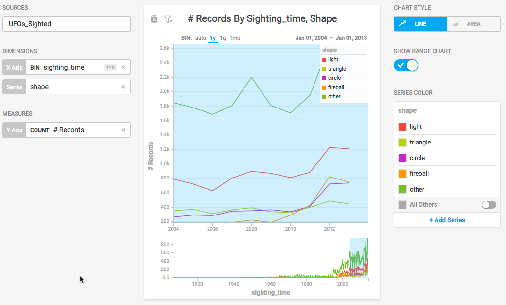
Categorize UFO sightings on the Dimension sighting_time and set the Measure to the number of records (the number of sightings).
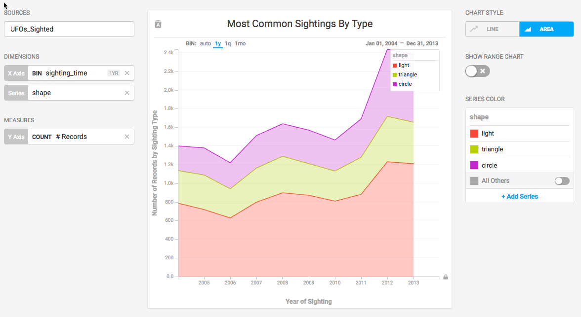
Adding the Dimension shape displays a separate line for each sighting type across time.
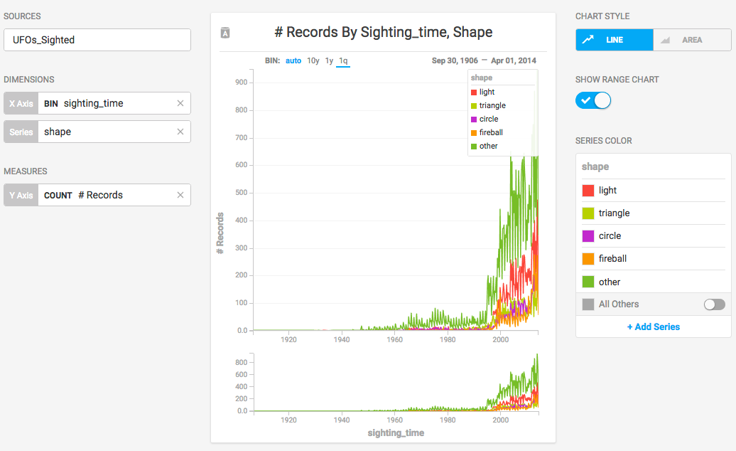
The records go back to 1905, with very few recorded sightings. Selecting a more recent 10-year block presents information in a more digestible form. For an ad hoc report, you can brush across values in the Range Chart to filter a smaller number of data points, or you can enter start and end dates on the x axis for precise values.
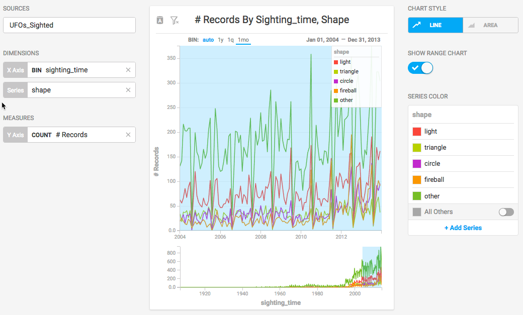
When you set the x axis to a date/time value, you have the option of setting the intervals to month, quarter, or year. Setting the BIN to 1y can make the values easier to discern.
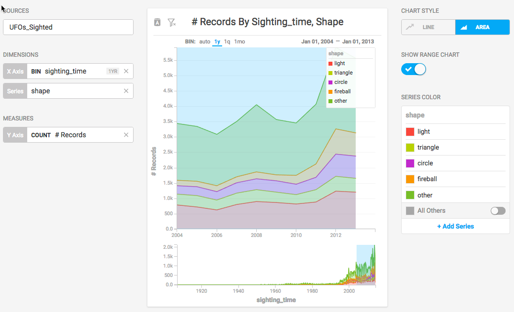
You can change from a line chart to an area chart, adding more contrast to make the differences between the values more apparent.
Once you are satisfied with the range values in the chart, you can turn off SHOW RANGE CHART to regain some screen space.
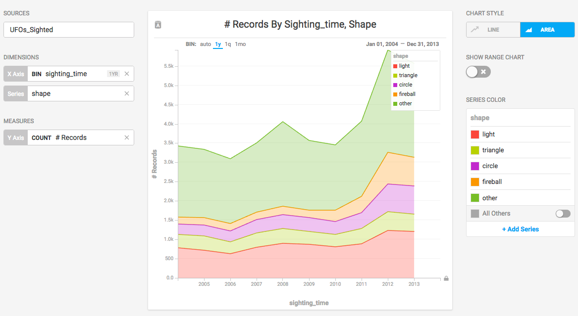
You can also reduce the number of series displayed by removing their entries on the COLOR PALETTE.
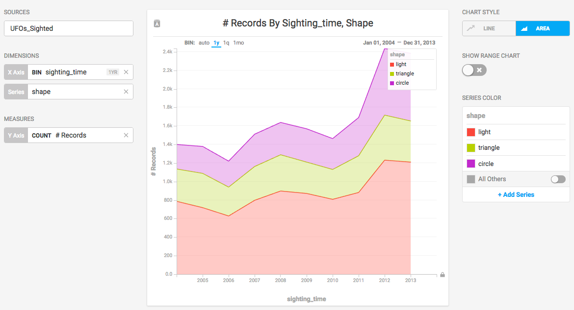
After you reduce the scope of the chart, you can change the labels on the axes and the chart title to reflect the current state of the information.